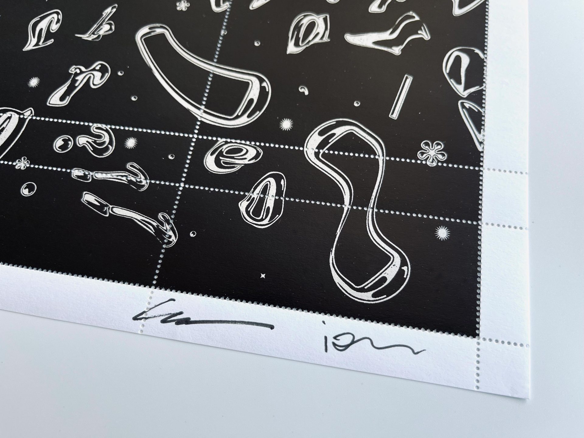
We have been collaborating with Ian Lynam for many years. This is his second appearance in the Artist Series. The first was Artist Series No. 15 made with Jeffrey Keedy.
Ian works at the intersection of graphic design, design education and design research. He is faculty at Temple University Japan in Tokyo. Ian operates a typographer at his Tokyo-based foundry Wordshape. He and his pal Eglif Pascal Santoso teamed up recently to create a new digital drawing of Cooper Chrome. Yes, Cooper Chrome!
Pascal is motion and graphic designer also based in Tokyo creating identity designs, illustrations, prints, ads, and animations for major Japanese companies.
Have you designed a stamp before?
Pascal: Nope! This was my first time. In fact, it never even crossed my mind to work on stamp designs, so I saw this as an exciting opportunity to expand the range of my work.
Ian: I did one before with Jeff Keedy for The Portland Stamp Company, as well as a commission for a not-yet-to-be-named nation that should debut later this year…
What was the most interesting or fun aspect of designing a poster stamp? What unique challenges did it present?
Ian: Pascal did all the work. It is challenging when your friend is such an amazing designer that all you can do is fiddle with details a little bit!
Pascal: Since this was my first time doing a stamp design, I wasn’t sure how to approach it. Ian suggested exploring type abstraction, so what I did was play around with the letter forms, warping and distorting the letters—I had a lot of fun with this process and I am happy with how it evolved into an abstract space-scape.
Tell us about the art. Did you create something new for this stamp?
Pascal: We created a whole new font set which we then used for the stamp.
Ian: This whole thing is born out of passion. Passion for stupid ideas and for potentially executing them. (The literal definition of passion is loving something so much that it hurts you.) And thus, this passion project.
Pascal: We both really love Cooper Black, especially the swash caps of the original Italic. We also really love the font Chromium One. One day we were thinking, “What would a mashup look like? Something that looks and feels like early 1980s BMX culture.”
Ian: Cooper Chrome Italic Pro includes two fonts which function as a chromatic set: Cooper Chrome Italic Pro and Cooper Black Italic Pro. By layering them on top of each other, you can create custom colored typography to get the perfect retro (or futuristic!) looks that you want!
Anything else?
Ian: We are just excited to work with PSC on this! Thank you! We hope to have a limited release mini-exhibition here in Tokyo once it is out. Details coming soon.

